Styleit Case Study
Styleit Case Study
Product: End to end application
Duration: 4 weeks / 80 hours
Role: UX/UI Designer
Styleit is a wardrobe inventory app designed to give its users access to a picture representation of every item in their closets in the palm of their hand. Styleit helps users avoid buying unnecessary clothing duplicates and utilize every item in their wardrobe efficiently.
It should be easy to know everything we own so we can make informed decisions in the moment.
After having been a stylist myself and seen both me and my clients completely forget about items we own, resulting in unnecessary money spent on duplicate items and frustration over having “so many clothes but nothing to wear” – we were all tired of it.
This was the general consensus from User Research as well:
People forget what clothes they have if they can’t actively see them.
Anyone dealing with weight fluctuation issues are frustrated not knowing which clothes will fit at any given time.
Most people have had the experience of buying something at the store, only to get home and realize they already have something just like it.
Introducing: Styleit, a Wardrobe inventory app
The solution for style enthusiasts to those who just want to feel comfortable in their clothes. Styleit allows users to have full visibility into their wardrobe at any time, saving money and time when getting dressed, as well as reducing frustration and contributing to an easier sense of self esteem.
My Process
To start, it was important to Understand: what actually impacts people when it comes to their wardrobe and the inability to see everything at once?
In order to discover user needs and wants, I utilized Secondary Research and User Interviews.
I discovered it is standard to use a photo inventory system to create visual representations of items.
According to competitive analysis, many of these apps create a free version that does not offer value and many users feel bitter about being “tricked” into needing the premium upgrade.
I found that the most loved apps were created specific to one industry or category (vs catering to many).
It also became clear that having functions outside of simple inventory capabilities is important to users. For example, a way to track the value of an item over time (cost vs. amount of wear), a calendar to plan outfits, a way to save favorite looks, or mix items in a user’s closet to create new looks they had never thought of before.
I then used User Research to discover what users truly needed and wanted when it came to taking inventory of their wardrobe.
One hurdle we ran into during User Research was there were a variety of needs and wants that would extend past the scope of an MVP style end to end project – however, this did create many viable options for future features.
We also found that there were some do’s and don’t’s for a seamless user experience.
1. Absolutely use photos to create an inventory
2. Do allow clothing to be sorted and searched via multiple defining characteristics such as color, occasion, and most definitely by size (this was not common among current existing apps).
3. Do help people keep track of outfits they enjoyed
4. Do make the upload process as easy as possible – perhaps even helping to remind them to finish uploading
There’s a Market for that
Through my interviews, I found there were three types of users:
Payton, the style oriented creative who tends to have tunnel vision around her outfits based on what she has been wearing lately
Chloe, the fashionista struggling to understand which items in her wardrobe fit her at the moment
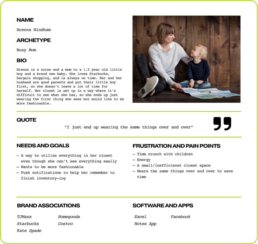
Brenna, the busy mom with a cramped closet who would like to feel more stylish, but tends to wear whatever is on top of the clothing pile because she doesn’t have time to dig through and can’t see what she owns.
The main features and functions interviewees highlighted as being important in their wardrobe inventory and viewing needs were:
1. The ability to see everything they own easily and effortlessly
2. Being able to sort between multiple categories to see what they own that fits their needs in the moment
3. The ability to see their current wardrobe through new eyes, creating outfits they didn’t think of on their own
4. The ability to see what is clean and available to be worn at the moment
The main piece that defined these personas was they all had a need to better see what they owned, but laid out in a way that allowed them to make Decisions easier.
Based on User interviews, I created a series of statements to direct my work on the Styleit app:
It then became clear that in order to implement any of these features effectively, it would be important to prioritize and focus.
For the core experience, I chose to focus on a combination of Chloe and Brenna’s personas by implementing a more streamlined flow for accessing Visual Closet Inventory with Push Notifications to remind them to finish, while being able to save Favorite Looks for future access. Also important is weaving in a feature that allows this information to be Searched easily by category.
This would support clarity and efficiency for the users as well as the business goals of customer retention, whereas focusing an automated outfit generator and/or the ability to sort clothes based on what was clean/available in real time can be a focus of the future.
Add to closet
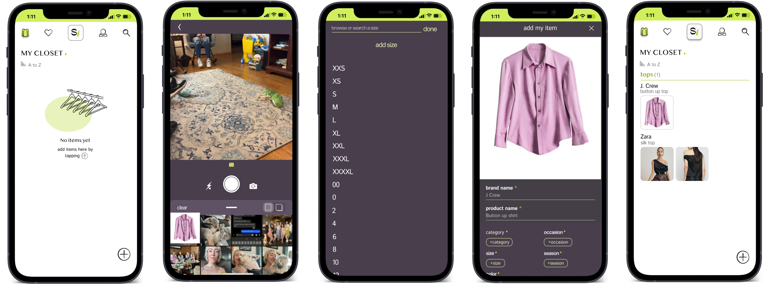
An Add to Closet feature that allows users to create photo representations of all of their items to their closet while categorizing them along the way.
Search
The ability to search by keyword or category designation.
Looks
A Create a Look feature that allows users to record and save looks for future wear.
Focusing on a seamless “Add to Closet” Experience would create the greatest value for the most users, secondary being a “Search” feature.
Within the three week timeframe, I chose to focus on the Add to Closet, Create a Look, and Search features. This helped the users have a more intuitive, personalized experience around the core functions of the app.
Search
Create a Look
Add to Closet + Push Notifications
IF I WAS Brenna, I WOULD WANT TO HIT A BUTTON AND know exactly what I have in my closet at any given time.
Low Fidelity WireFrames
The Low Fidelity Wireframes gave a rough outline for when and where to place different elements + the components needed to make the user flows a reality.
Styleit’s brand captures the trendy yet sleek nature of the world of Fashion.
With the layout from the wireframes, I began to build Styleit’s brand.
I built a style guide that encompassed Styleit's modern aesthetic accented with a bright, exciting neon green reminiscent of the worlds of pop art and street style fashion, pairing them with a dark gray for minimalism and contrast.
I then created Styleit’s logos using two modern yet sleek fonts, adding Styleit’s signature green for a pop of color and personality.
Ultimately, the app is meant to speak to trendsetters, so it stands out as being bold and sleek with a modern feel.
The Final Product
Insights gathered from my rounds of user testing included:
Users found the prototype aesthetically pleasing without being overwhelming.
Users suggested adding a 30 second tutorial to outline app features and functions.
The only necessary iterations involved resolving some timing issue with the pop-up/overlay and adjustments to some alignment issues.
Improvements
I took the feedback from my Usability Tests and created a “30 second tutorial” to give users an overview of the app flow. I also changed where and when the popups appeared to make the most sense to users, as well as slightly adjusting copy to be clearer.I then added the option to add a cover photo to each Look
Although it is recommended to focus on the current core experiences for now, as the app grows, offering an outfit remix feature and the ability to understand which items are clean/available in real time will be worth looking into. This will allow Styleit to add unique value to the app and increase customer satisfaction and retention.


